Android选择按钮
本文最后更新于:2025年2月13日 晚上
选择按钮
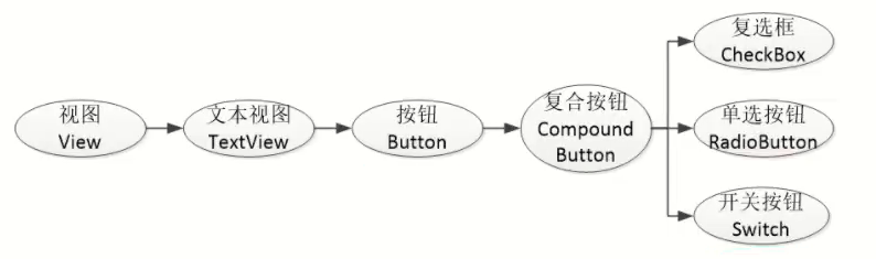
在学习复选框之前,先了解一下CompoundButton。在Android体系中,CompoundButton类是抽象的复合按钮,因为是抽象类,所以它不能直接使用。实际开发中用的是CompoundButton的几个派生类,主要有复选框CheckBox、单选按钮RadioButton以及开关按钮Switch,这些派生类均可使用CompoundButton的属性和方法。加之CompoundButton本身继承了Button类,故以上几种按钮同时具备Button的属性和方法,它们之间的继承关系如图所示。
compoundButton 在XML文件中主要使用下面两个属性:
- checked:指定按钮的勾选状态,true表示勾选,false则表示未勾选。默认为未勾选。
- button:指定左侧勾选图标的图形资源,如果不指定就使用系统的默认图标。
CompoundButton 在Java代码中主要使用下列4种方法:
- setChecked:设置按钮的勾选状态。
- setButtonDrawable:设置左侧勾选图标的图形资源。
- setonCheckedChangeListener:设置勾选状态变化的监听器。
- ischecked:判断按钮是否勾选。
复选框CheckBox
对图标进行定制
自定义drawable文件checkbox_selector.xml
<selector xmlns:android="http://schemas.android.com/apk/res/android">
<item android:state_checked="true" android:drawable="@drawable/check_choose" />
<item android:state_checked="false" android:drawable="@drawable/check_unchoose" />
</selector>
Activity对应的xml文件
<CheckBox
  android:button="@drawable/checkbox_selector"
/>
更改初始选中状态
<CheckBox
  android:button="@drawable/checkbox_selector"
  android:checked="true"
/>
事件监听
onCreate方法里:
setOnCheckedChangeListener(this);Activity要 implements CompoundButton.onCheckedChanged
@Override
public void onCheckedChanged(CompoundButton buttonView, boolean isChecked){
  String desc = String.format("您%s了这个checkBox", isChecked ? "勾选":"取消勾选");
  buttonView.setText (desc);
}
开关按钮Switch
Switch是开关按钮,它在选中与取消选中时可展现的界面元素比复选框丰富。Switch 控件新添加的XML属性说明如下:
- textOn:设置右侧开启时的文本。
- textOff:设置左侧关闭时的文本。
- track:设置开关轨道的背景。
- thumb:设置开关标识的图标。
自定义切换按钮示例:
(1)在drawable文件夹中定义switch_selector.xml
<selector xmlns:android="http://schemas.android.com/apk/res/android">
    <item android:drawable="@drawable/switch_on" android:state_checked="true" />
    <item android:drawable="@drawable/switch_off" />
</selector>
(2)在所属Activity中加入
<LinearLayout
    android:layout_width="match_parent"
    android:layout_height="wrap_content"
    android:orientation="horizontal">
    <TextView
        android:layout_width="0dp"
        android:layout_height="wrap_content"
        android:layout_gravity="start"
        android:layout_weight="1"
        android:padding="5dp"
        android:text="Switch自定义开关" />
    <CheckBox
        android:id="@+id/ck_status"
        android:layout_width="50dp"
        android:layout_height="45dp"
        android:layout_gravity="end"
        android:background="@drawable/switch_selector"
        android:button="@null" />
</LinearLayout>
效果: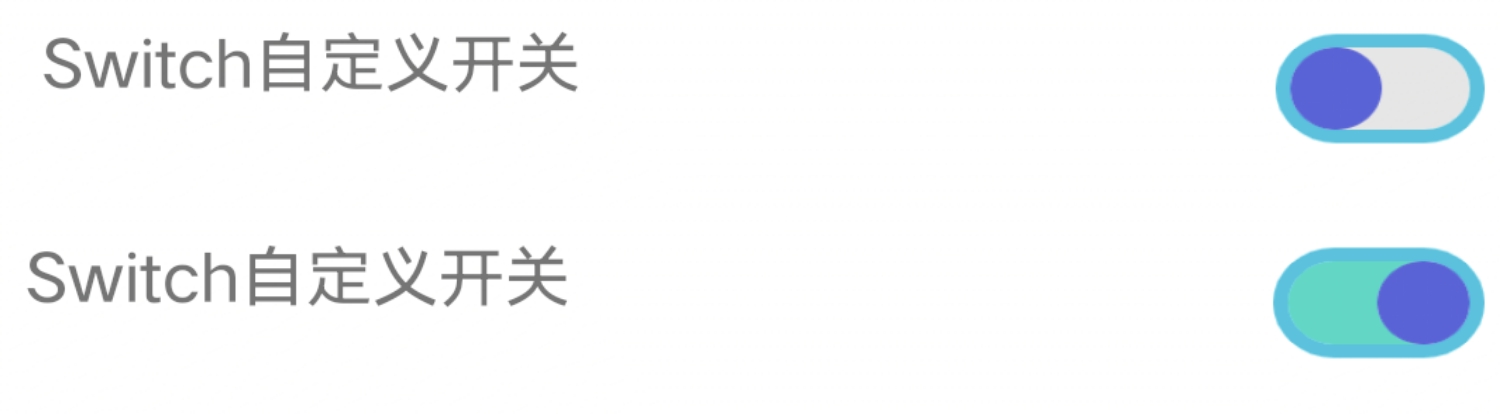
单选按钮RadioButton
在Android中,单选按钮使用RadioButton表示,RadioButton又是Button的子类,所以单选按钮可以直接使用Button支持的各种属性。
<RadioButton
    android:text="显示文本"
    android:id="@+id/ID号"
    android:checked="true|false"
    android:layout_width="wrap_content"
    android:layout_height="wrap_content">
</RadioButton>
通常情况下,RadioButton组件要与RadioGroup组件一起使用,组成一个单选按钮组。在XML布局文件中,添加RadioGroup组件的基本格式如下:
<RadioGroup
    android:id="@+id/ID号"
    android:orientation="horizontal"
    android:layout_width="warp_content"
    android:layout_height="warp_content">
<!--添加多个RadioButton组件-->
</RadioGroup>
RadioGroup实质上是个布局,同一组RadioButton都要放在同一个RadioGroup节点下。除了RadioButton,也允许放置其他控件。
判断选中了哪个单选按钮,通常不是监听某个单选按钮,而是监听单选组的选中事件。
下面是RadioGroup常用的3个方法:
- check:选中指定资源编号的单选按钮。
- getCheckedRadioButtonld:获取选中状态单选按钮的资源编号。
- setOnCheckedChangeListener:设置单选按钮勾选变化的监听器。